Beer Bottle Labels Doing More Brand Storytelling Than the Brewery Website Ever Could
Craft beer drinkers are not reading your About page before they reach for a bottle. They scan the fridge, compare colours, and chase clever phrases until something pulls them in. That tiny rectangle of printed art is doing the heavy lifting your homepage wishes it could, and most breweries still treat it as an afterthought.
Smart breweries already figured this out, which is why beer bottle labels remain the single most powerful branding tool in the craft beverage industry today. They sit in coolers, on shelves, in eskies, and at backyard barbecues. They get seen more than any banner ad, more than any influencer post, and certainly more than the brewery website nobody opens twice. They quietly sell while you sleep.
Why Your Label Is Talking Louder Than Your Marketing Team
Shelf Presence Beats Search Rankings: Walk into any bottle shop and watch how shoppers behave. They run a finger along the shelf, picking up bottles that catch the eye, ignoring the ones that blend in. Search engines might bring traffic to a website, but the real conversion happens in the cooler aisle where colour psychology decides whether a customer pauses or keeps walking.
The Loyalty You Cannot Buy With Ads: Repeat purchases in craft beer come from emotional recognition, not algorithms. A drinker who loved that quirky illustration last weekend will hunt for it again. The label becomes the memory, the shorthand, the inside joke. Websites cannot recreate that moment of recognition in the wild, but a well-printed bottle can.
First Impressions Happen on the Shelf: Most craft beer purchases are not planned. Someone sees the bottle, likes the look, and grabs it. That snap decision happens in seconds, long before any website tab opens. Spending months perfecting digital content while ignoring the label means pouring effort into the wrong battle, because the real fight for attention happens at eye level.
See also: What to Check Before Choosing Around Lowest Dose of Metformin You Can Take in 2026
Generic Designs Are Where Good Beer Goes to Die
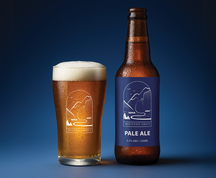
Beige Bottles, Forgettable Brand Stories: Plenty of breweries pour their soul into the recipe and then slap a forgettable label on top. Pale fonts. Stock illustrations. The same earthy palette every other brewery already used. Drinkers do not need another safe choice, they need a reason to grab this one. Forgettable packaging quietly kills sales the beer itself absolutely deserved.
The Cost of Looking Like Everyone Else: A bland label does not just sit there, it actively competes against your own beer. Buyers pass it over for something braver, and that lost sale never shows up in your analytics. Strong typography choices can change everything, turning a passable bottle into one that actually earns its place on the shelf.
Standing Out Without Being Obnoxious: There is a difference between bold and brash. The best craft labels feel confident without screaming for attention. Clever illustrations, unexpected colour combinations, or a smartly placed brewery logo can do the work without needing fluorescent shock value. Distinctive does not mean garish, it just means thinking harder than the brewery next to yours.
Print Finishes That Earn Their Place on the Shelf
Texture Tells a Story Before You Read It: The way a label feels in someone’s hand changes how they value the product inside. Uncoated paper signals craft and care, while a smooth laminate suggests cleaner, modern energy. Both have their place in the craft scene, and choosing the right one becomes part of the brand conversation long before anyone tastes the beer.
Finishes Worth Putting Into the Mix: Different print finishes do different jobs, and picking the right combination changes how a brand reads on a busy shelf. Some add weight and gravitas, others bring playfulness or a hand-crafted edge. A few worth weighing up include:
- Matte laminate for a soft, premium feel that handles condensation without going shiny
- Gloss laminate when colours need to pop and grab attention from across the shop floor
- Uncoated paper stock for that textured, artisanal feel drinkers associate with small-batch quality
- Synthetic silver to mimic a foiled effect without the cost or supply hassle of traditional methods
When Spilled Beer Meets Your Carefully Designed Label
Moisture Resistance Is Not Optional: Beer bottles live wet lives. They sweat in eskies, soak in ice slurries, and get handled by sticky fingers at backyard parties. A label that peels, warps, or smudges within an hour is doing brand damage in real time. Choosing moisture-resistant stock means the design still looks sharp by the time someone picks up the empty.
Durability That Protects the Brand: Synthetic label stocks shrug off condensation in ways paper alone cannot. For breweries selling into bottle shops, festivals, and outdoor events, that kind of durability matters more than people admit. Customers connect cared-for packaging with cared-for beer, and a label that survives the journey from cooler to coaster is quietly selling the next round.
Print Quality That Reflects the Craft: A wonky print run undermines every story trying to be told. Smudged ink, misaligned colours, or peeling edges suggest a brewery cutting corners, fairly or not. Quality printing on the right substrate signals professionalism without saying a word, and that quiet confidence becomes part of how customers judge the beer before tasting it.
Where the Bottle Becomes the Brand
The best breweries treat every bottle like a billboard, every label like a salesperson, and every print choice like a business move. Drinkers remember designs that surprise them and finishes that survive a Saturday night. If your current labels are not pulling that weight, it might be time to chat with a team printing custom labels Australian breweries actually want on their bottles.